The Set I Didn’t Choose… But Couldn’t Ignore: Power Glove Dice Set Review
There are dice you hunt for; dice you wait on; dice you decide belong at your table. And then there are the ones you don’t choose at all.
I didn’t choose the Power Glove dice from Dispel Dice. They arrived as a courtesy. I didn’t know what to expect beyond “Dispel makes quality dice.”
That turned out to be… an understatement.
Note: This set was provided by Dispel Dice for review purposes. No editorial direction or requirements were given, and all opinions below reflect my own table experience.
🎮 First Impressions: Straight Out of the Arcade
The moment these hit the table, they carried a very specific energy:
- 1980s.
- Arcade glow.
- Max Headroom.
- Nintendo Power Glove.
Not inspired by it. Rooted in it.
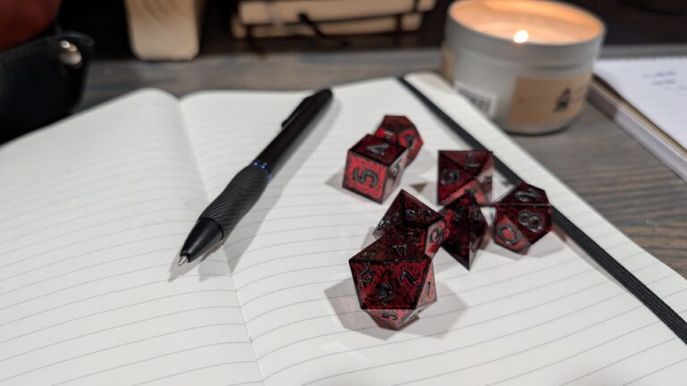
These are glossy black dice, clean and deliberate, with not-so-subtle neon insets that feel like they were pulled straight from an 8-bit screen. The design isn’t loud, it’s controlled. Intentional. And it works.
“I didn’t choose these dice, but they demanded attention the moment they hit the table.”
✨ Craftsmanship & Design: Dispel Doing Its Thing
If you’ve handled Dispel Dice before, you already know what I’m about to say.
These are flawless.
- No imperfections
- Clean edges
- Cohesive design language
- A finish that feels premium the moment you pick them up
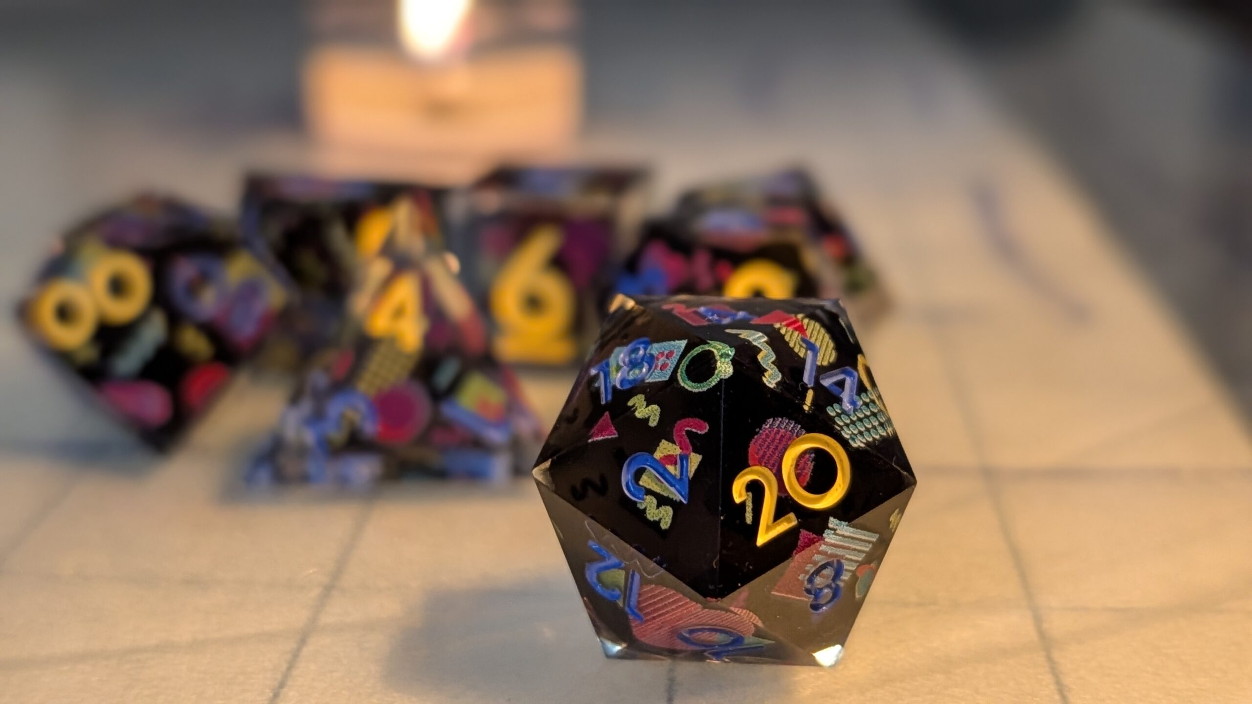
The glossy black body carries a faded navy numbering that blends into the surface just enough to feel stylized without disappearing entirely, at least in good lighting.
And then there’s the standout feature: The high number on each die, rendered in a bright neon yellow. It’s a brilliant idea. A “high score” moment baked directly into the design.
🖐️ Feel & Roll: Heavy, Sharp, and Satisfying
These are 25mm sharp-edged dice, and you feel it immediately.
- Weight: heavy but deliberate
- Edges: sharp! Very sharp (watch that d4)
- Motion: controlled tumble, minimal bounce
They roll similarly to the Labyrinth set, soft landings in a leather tray, satisfying travel across the table without chaotic bounce. They don’t dominate the space despite their size, but they do carry presence.
And importantly: They are a pleasure to roll.
“Heavy, sharp, and deliberate, these dice don’t just roll, they arrive.”
👀 Readability: Where Style Pushes Back
This is where the conversation shifts. In bright light, the navy numbering is readable. In dimmer light, where many of our tables actually live, that same design choice starts to work against the dice.
- Low contrast causes numbers to fade into the body
- Rolls require a second look to confirm
- The experience slows down just enough to notice
Meanwhile, the neon yellow max face? Crystal clear. Visible across the room. Which makes the contrast even more noticeable.
🍻 At the Table: Admired, But Not Claimed
When these came out, the reaction was immediate: Ooh. Those are cool. Wow.
They look incredible. But then came the follow-up: Wait, what did you roll?
There wasn’t a shift in table energy. No one claimed them as their own. But they were consistently admired. And that says something important: These are respected dice, not grabbed instinctively.
📣 Pull Quote (mid-article)
“Everyone loved how they looked. Everyone double-checked what they rolled.”
⚖️ Value & Verdict
At $85, these sit firmly in the premium dice category.
And in terms of craftsmanship, finish, and design cohesion, they absolutely justify that price point. They stand comfortably alongside other Dispel sets like the Labyrinth, Exsanguinated, and Devil You Know sets that I’ve reviewed here.
But value isn’t just about build quality, it’s about use.
🧠 Final Thoughts: A Nostalgic Showpiece with a Cost
The Power Glove set is a love letter to the 1980s. It captures that aesthetic beautifully: clean, controlled, and unmistakably retro. But it also asks something of the player: Slow down. Look closer. Engage with the object, not just the result.
For some tables, that’s part of the ritual. For others, it’s friction.
“These dice don’t chase attention, they earn it. Even if they make you work a little for the result.”
🎯 Who Are These For?
✅ Players who love retro aesthetics
✅ Collectors of premium, themed dice
✅ Tables that value tactile and visual experience
⚠️ Maybe not ideal for:
- Fast-paced combat tables
- Low-light sessions
- Players who prioritize instant readability
🏁 Final Verdict
A beautifully crafted, deeply nostalgic set that delivers on design and feel, but asks for a little patience in return.
Not perfect. But undeniably compelling.